Most people think Graphic Design is about making things look "cool" or "pretty." This is wrong. Design is not art. Art is about expression; Design is about solution. Graphic Design is the organization of information to make it easy for the brain to understand.
- The Goal: Design exists to solve a problem (e.g., "Nobody reads our menu").
- The Tool: "White Space" is the most important element. It lets the eyes breathe.
- The Rule: If you emphasize everything, you emphasize nothing.
- The Psychology: Color and Font choice subconsciously tell people if you are cheap or expensive.
1. The "1-Second" Rule
When a customer looks at a flyer, a website, or a business card, their brain makes a decision in less than 1 second: "Is this for me?" or "Is this trash?"
If your design is cluttered, uses 5 different fonts, or has low-contrast colors, the brain categorizes it as "Noise" and ignores it. Good design is about removing noise until only the signal remains.
2. The 4 Pillars of Logic
You don't need to be an artist to judge design. You just need to check these four pillars. If one is weak, the structure falls.
Fonts have personalities. A serif font (Times New Roman) feels traditional and serious. A sans-serif font (Helvetica) feels modern and clean. Never use Comic Sans unless you are selling lemonade.
Blue is trust (Banks). Red is urgency (Sale/Food). Black is luxury. Using the wrong color confuses the customer's gut feeling about your product.
Empty space is not wasted space. It is "Active Space." It pushes the eye toward the content. Luxury brands use tons of white space. Discount brands fill every inch.
Repetition creates memory. Use the same font size for every header. Use the same shade of blue on every page. Inconsistency looks unprofessional.
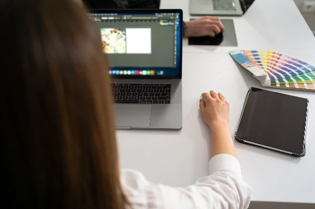
3. The Canva vs. Professional Debate
Canva is an amazing tool. We love it. But Canva is a template engine. It makes everyone look the same.
When to use Canva: Instagram posts, internal presentations, quick flyers.
When to hire a Designer: Your Logo, your Website, your Packaging, and your Billboards. These are high-stakes assets. If your logo looks like clip-art, people will assume your business is a hobby.
Clients always want the logo bigger. This is usually a mistake. A giant logo screams "Insecurity." A modest, well-placed logo says "Confidence." Look at Apple or Nike ads. The logo is usually small.
4. The Pre-Print Checklist
Sending a design to a printer? Don't waste money on a bad print run. Check this first:
Is Your Brand Messy?
Get a free "Visual Health" audit of your flyers and website.